Which study skills strategies can improve students’ academic performance?
Page 2: Graphic Organizers
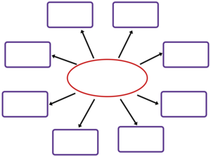 Students like Kyra who have difficulty processing information often have trouble connecting new ideas and concepts to their prior knowledge, identifying main ideas and important pieces of information, and ignoring irrelevant information. Graphic organizers, sometimes called webs or concept maps, can help these students more easily process information. More specifically, these tools allow students to:
- Organize information
- See the relationships between ideas
- More easily understand, remember, and apply information
Douglas Dexter, whose primary research interest is successful inclusion practices for adolescents with LD, has focused much of his attention on the effectiveness of graphic organizers. Listen as he describes three reasons that graphic organizers are effective for students with learning difficulties (time: 2:02).

Douglas Dexter, PhD
Assistant Professor of Special Education
The Pennsylvania State University
Transcript: Douglas Dexter, PhD
The good news about graphic organizers and in such content enhancements, they really benefit everyone. This isn’t just a tool for my students with high-incidence disabilities. This is a tool that’s going to really help everyone in the classroom. Why are graphic organizers so effective? We have three big ideas that we can focus on. The first one, graphic organizers make information extremely explicit and clear. The spatial arrangement of the main concepts or information on the graphic organizer make it very clear for the students how those facts or concepts are related. It makes those relationships very apparent. And when I talk about relationships, those can be temporal, having to do with time, spatial, semantic, sequential, hierarchical, or comparative. The second big idea for why graphic organizers are effective is because they serve as a bridge between new information and prior knowledge. So as a teacher if I present very general ideas of a new concept and compare that to a concept that I have previously taught my students, it’s going to better allow my students to understand that information and link it to their prior knowledge, which is critical for students to learn new information. This is much more effective than giving an introductory lecture or a text introduction to a new subject. And finally the third big idea for why graphic organizers can be so effective for students with LD and ADHD is because graphic organizers really minimize the stress on the working memory. Students with LD and ADHD, they have difficulty identifying those main ideas and supporting details. They have those issues with identifying and ignoring extraneous information. If we can cut that out for our students, really cut the fluff so to speak, we can really minimize the stress on the working memory, which is going to allow the students to learn much more about the subject.
Research Shows
- A systematic review of mathematics interventions showed that graphic organizers, either as a stand-alone strategy or with other instructional strategies (e.g., problem-solving, mnemonics, multiple representations), had positive outcomes with middle school students.
(Powell et al., 2021) - The results of a single-case design study indicated that the use of a funnel map helped Spanish-English bilingual students with learning disabilities comprehend descriptive expository texts. Moreover, all students reported that the funnel map made it easier to find information in the text.
(Calvin & Gray, 2023) - A meta-analysis shows that middle and high school students with disabilities who used graphic organizers to learn science content displayed increased vocabulary knowledge and comprehension.
(Dexter, Park, & Hughes, 2011)
Because there are many kinds of graphic organizers, teachers should carefully select those that will best convey the information and relationships they wish for their students to learn. The table below lists several of the most common types of graphic organizers and the purposes for which they can be used. Click on them to learn more as well as to see completed versions of each (when the link is clicked, the content will open underneath the table).
Cause and Effect
Cause and effect chain
Students can use this type of graphic organizer to clarify the relationship between specific events and the outcomes deriving from them, thus illustrating the concepts of consequences, inevitability, and causality.
Example
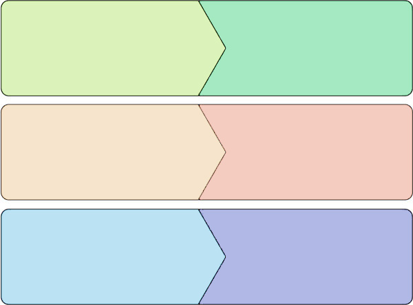
Romeo secretly attends the Capulets’ masquerade
Romeo falls in love
with Juliet
Romeo slays Tibalt
The prince banishes Romeo
from Verona
Friar John fails to deliver his message to Romeo
Romeo falsely believes
Juliet to be dead
This cause-and-effect chain depicts three events (left side) and their corresponding outcomes (right side) from Romeo and Juliet. The top event is “Romeo secretly attends Capulets’ masquerade,” with the outcome being “Romeo falls in love with Juliet.” The next event in the middle is “Romeo slays Tibalt,” with the outcome being “The prince banishes Romeo from Verona.” The last event at the bottom is “Friar John fails to deliver his message to Romeo,” with the outcome being “Romeo falsely believes Juliet to be dead.”
Problem and solution map
Example
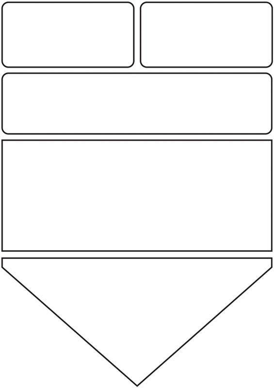
Cause
Longer than usual period without rain
Cause
Population growth increases demand for water
Problem
Citywide water supply shortage
- Fine residents for overuse of water
- Purchase water from neighboring states
- Offer subsidies to farms and industry to limit water use
- Create program to encourage homeowners to use water more responsibly
This graphic organizer depicts how a water supply shortage can have multiple causes and solutions. The top two boxes feature the causes: “Longer than usual period without rain” on the left and “Population growth increases demand for water” on the right. Below them is the problem box: “Citywide water supply shortage.” Underneath is the solutions box with a numbered list: “(1) Fine residents for overuse of water, (2) purchase water from neighboring states, (3) offer subsidies to farms and industry to limit water use, and (4) create program to encourage homeowners to use water more responsibly.” The last box features the result box: “Combined, these approaches help the city to make it through the remainder of the dry summer months.”
Fishbone diagram
Also called an Ishikawa diagram (after its inventor), this type of graphic organizer can be used to show a range of complex causes and interactions that lead to specific events.
Example
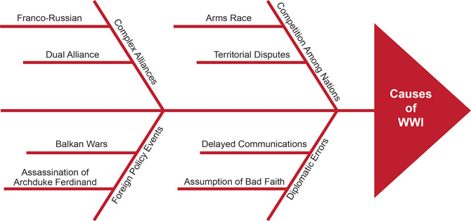
This fishbone graphic organizer illustrates the various primary causes of World War I: Competition Among Nations, Diplomatic Errors, Complex Alliances, and Foreign Policy Events. Secondary causes of the war branch out from each primary cause. The secondary causes that fall under Competition Among Nations are Arms Race and Territorial Disputes. The secondary causes falling under Diplomatic Errors are Delayed Communications and Assumption of Bad Faith. The secondary causes that fall under Complex Alliances are Franco-Russian and Dual Alliance. Finally, the secondary causes falling under Foreign Policy Events are Balkan Wars and Assassination of Archduke Ferdinand.
Classifying
Web
Students can use a web to categorize or classify items.
Example
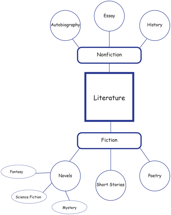
In this web graphic organizer, the central term “literature” is divided into a pair of major categories: “fiction” and “nonfiction.” These categories, in turn, are broken into more specific units. “Nonfiction” leads to “autobiography,” “essay,” and “history.” “Fiction,” meanwhile, spreads out to “novels,” “short stories,” and “poetry.” The term “novels” becomes more specific yet, breaking down to genre categories like “fantasy,” “science fiction,” and “mystery.”
Classification table
Students can use this simple organizer to sort or classify information or objects into different categories.
Example
| Types of Rocks with Examples | ||
| Igneous | Sedimentary | Metamorphic |
| Obsidian Basalt Pumice Granite Mica Quartz |
Sandstone Shale Fossils Limestone Gypsum |
Slate Marble Quartzite Schist Gneiss |
This table categorizes “Types of Rocks with Examples.” From left to right, the column subheadings underneath include “Igneous,” “Sedimentary,” and “Metamorphic.” Listed within the Igneous category are obsidian, basalt, pumice, granite, mica, and quartz; listed within the Sedimentary category are sandstone, shale, fossils, limestone, and gypsum; and listed within the Metamorphic category are slate, marble, quartzite, schist, and gneiss.
Comparing and Contrasting
Venn diagram
Named after their creator, Venn diagrams are a type of graphic organizer used to show the overlapping relationships between various categories of ideas, things, events, mathematical expressions, or logical concepts.
Example
The primary nations that made up the Central Powers of World War I and Axis alliance of World War II
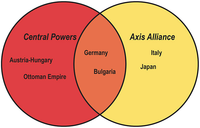
This Venn diagram depicts the primary nations that made up the Central Powers of WWI and the Axis alliance of WII. The left circle features the Central Powers, including Austria-Hungary and the Ottoman Empire, while the right circle representing the Axis alliance includes Italy and Japan. The overlapping middle section includes Germany and Bulgaria.
Compare-contrast matrix
Students can use this type of graphic organizer to clarify what is the same and what is different about the selected people, places, or objects.
Example
| Attribute | Japan | China |
|---|---|---|
| Government | Unitary Parliament/ Constitutional Monarchy |
Single-Party State |
| Official Language |
Japanese | Mandarin |
| Population | 127 million | 1.35 billion |
| Geographic Location | Asia | Asia |
This matrix organizer compares aspects of Japan and China. From left to right, the column headings include “Attribute,” “Japan,” and “China.” The first comparison examines government, with Japan having a unitary parliament/constitutional monarchy while China has a single-party state. The next comparison examines official language, with Japan speaking Japanese while China speaks Mandarin. The third comparison examines population, with Japan having 127 million people while China has 1.35 billion people. The last comparison examines geographic location, with both countries being in Asia.
Describing
Word web
Word webs are graphic organizers that help students to better understand a key vocabulary term by connecting it to related terms.
Example
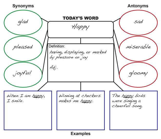
This vocabulary graphic organizer depicts different aspects of a word. In the center of the graphic organizer Today’s Word is listed. Today’s Word is “happy.” Under the word is the definition of happy: “having, displaying, or marked by pleasure or joy, adj.” Under the definition of happy are three examples of Today’s Word in sentences. The first example is “When I am happy, I smile.” The second example is “Winning at checkers makes me happy.” The third example is “The happy birds were singing a cheerful song.” To the left of Today’s Word are three synonyms for happy. The synonyms are “glad,” “pleased,” and “joyful.” To the right of Today’s Word are three antonyms for happy. The antonyms are “sad,” “miserable,” and “gloomy.”
Frayer Model
This type of graphic organizer is used to help students develop more comprehensive vocabulary skills by offering not only a definition and examples of what a given person, place, event, or thing is but also a definition and examples of what those things are not.
Example
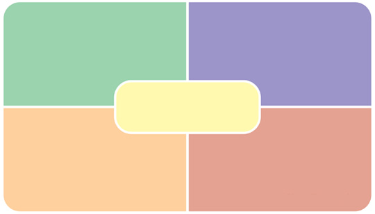
This graphic organizer dissects the concept of a triangle using a rectangle divided into four quadrants, with the idea name overlayed in the middle. The top left quadrant features the definition: “A basic geometric shape; a closed pane form having three sides and three angles.” The top right quadrant features the characteristics: “A triangle is a three-sided polygon with three vertices (or sides).” The bottom right quadrant features the nonexamples: “Square (four equal sides), octagon (eight sides), and circle (no sides).” And the bottom left quadrant features the examples: “Scalene, equilateral, and isosceles.”
Semantic map
Teachers can use semantic maps to help students to better understand the ways in which words, categories, and concepts are related to one another. This organizer is a type of web that allows students to add in descriptive information about the content.
Example
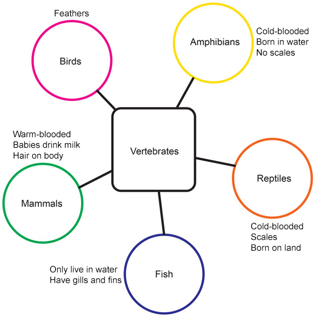
A semantic map illustrates some of the ways in which words, categories, and concepts are related to one another. In this version of such a map, the key term “vertebrates” is surrounded by a number of specific examples: “amphibians,” “reptiles,” “fish,” “mammals,” and “birds.” Descriptive information has been added beside each of these examples. For example, “amphibians” has been annotated to read “cold-blooded, born in water, no scales.” “Reptiles” reads “cold-blooded, scales, born on land.” “Fish” says “only live in water, have gills and fins.” “Mammals” reads “warm-blooded, babies drink milk, hair on body.” Finally, “birds” is annotated “feathers.”
Sequencing
Flowchart
This common type of graphic organizer breaks down the important steps in a process or sequence and can be used to solve problems or clarify multipart procedures.
Example
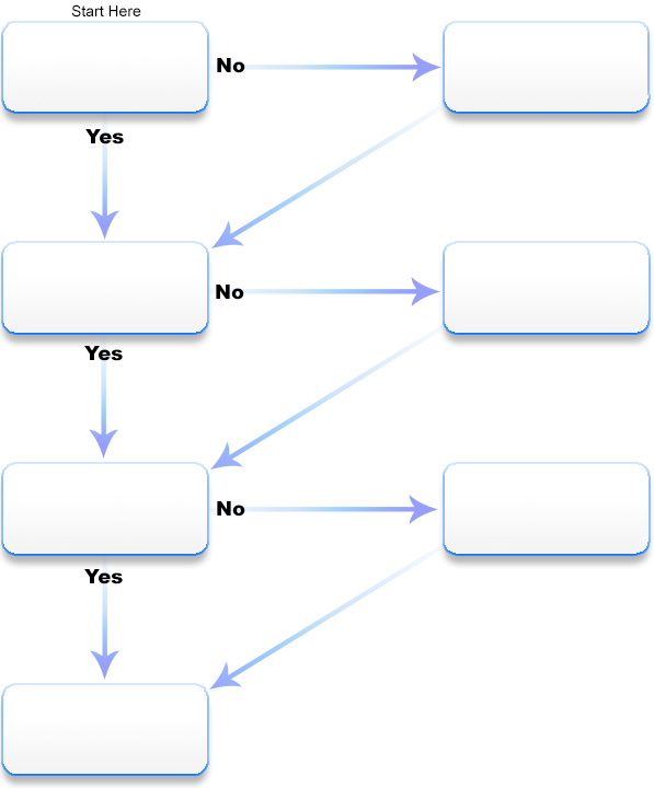
This diagram presents a step-by-step approach to writing a paper using boxes and arrows to guide users through the workflow. “Yes” arrows direct users down to the next primary step (formatted as questions) in the left column of boxes, creating the most direct path. “No” arrows redirect users to solutions in the right column of boxes before rejoining the main path. The top left box asks, “Have you developed a thesis for your paper?” If not, “create a clear, straightforward statement of what your essay is about.” The next step asks, “Have you located references and resources for your paper?” If not, “locate books, journals, and newspaper articles.” The final step before writing asks, “Have you created an outline for your paper?” If not, “break your essay into parts to create a smoother and more logical flow of information.” Finally, “begin writing.”
Series of events chain
Similar to a timeline of events, this type of graphic organizer can be used to demonstrate how a linear sequence leads to a specific outcome.
Example
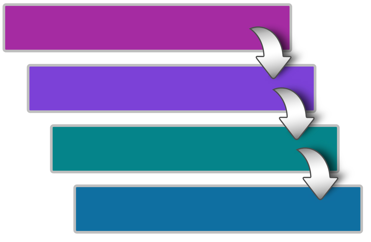
This graphic organizer depicts a vertical timeline of The Odyssey, with subsequent events being increasingly indented to the right as they move toward the specific outcome. The first event at the top is “Odysseus and his men land on the island of Cyclopes,” followed by “They are soon captured by Polyphemus and trapped in his cave,” “Odysseus affects an escape, blinding Polyphemus as part of the ruse,” and finally “Polyphemus prays to Poseidon, who greatly lengthens Odysseus’ journey home.”
Cycle
This variety of graphic organizer can help students to more fully comprehend series of events or phenomena that take on recurrent patterns.
Example
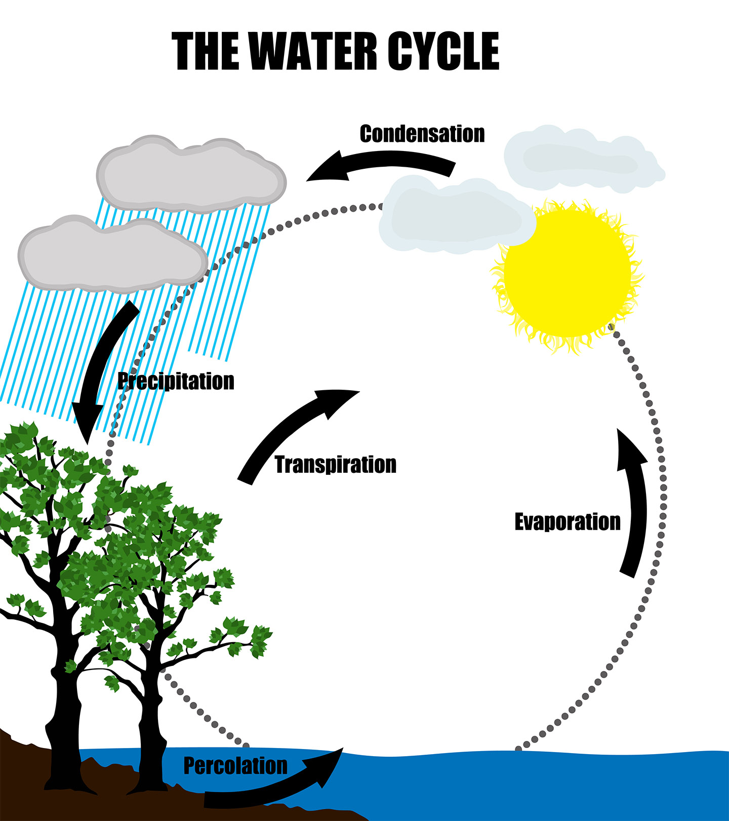
This graphic organizer shows the recurring pattern of the water cycle using labeled arrows: (1) “percolation” and “transpiration” occur as water makes its way from the ground and plants, (2) “evaporation” occurs as water heats up and makes its way into the atmosphere, (3) “condensation” occurs as water cools to form clouds, and (4) “precipitation” occurs as water returns to the earth.
Timeline
This simple and familiar type of graphic organizer arranges events in chronological order to help students better grasp the relationship between historical occurrences or developments.
Example

This timeline graphic is shaped like a double-headed arrow and is divided into single-year increments, a few of which are labeled with some of the major events leading up to the American Revolutionary War. Beginning with 1765, the timeline highlights the Stamp Act then proceeds to similarly spotlight the Boston Massacre in 1770, the Boston Tea Party in 1773, the First Continental Congress in 1774, and the Declaration of Independence in 1776.
Douglas Dexter discusses the importance of consistently using the same graphic organizer for similar tasks (e.g., comparing and contrasting), what he refers to as the “verbal structure” of the lecture or text (time: 2:06).

Douglas Dexter, PhD
Assistant Professor of Special Education
The Pennsylvania State University
Transcript: Douglas Dexter, PhD
I think it’s very important that teachers pick out graphic organizers based on the verbal structure of their lecture or their text. It doesn’t matter which one you pick. The big idea is as long as you are making those relationships very clear and very explicit, just keep using that same organizer time after time. Then you’re optimizing your instructional time because the students—after you’ve modeled it for them for a while and they’ve gotten some practice with it—they can do that much more independently. And so you’re going to get a lot more time to cover the content, and the students are going to be able to absorb that content again through their working memory. They’re able to encode this information much more efficiently if they are using organizers that they understand. What’s going to happen after several months of using these in the classroom, the students then become much more independent. They become self-reliant, and they become self-regulators, and what we see is they can effectively pick out, and they know which organizer to use. So they can see a text structure, and they can say, “Okay, I see what’s happening here, and this is the organizer that we’ve been using in my class, so I will pick that out.” And the good news here is it’s never too late. Of course it would be wonderful if we got our students thinking in this way even before middle school, but even if I’m teaching an eleventh grade English class or twelfth grade English class, if I introduce this to my students, they’re going to be able to get this and it’s going to benefit them for a very long time. In my longitudinal research, what I find is even when students leave the classrooms that we are in and move up in grades, move up from middle school to high school, they’re going to other classes, and they’re using these same graphic organizers because it really cuts across all of the content areas. And getting students to think this way—and especially our students with learning disabilities and ADHD—really will give them a great benefit and a leg up in being very successful in the secondary level.
Tip
Regardless of the graphic organizer the teacher selects, it must clearly demonstrate the relationship between pieces of information.
Activity
 Hannah, Erin, and Kyra were asked to read a brief article about sand dunes* and to use a graphic organizer of their choice to organize the information. All three students chose to use a web. Click here to view their graphic organizers. Select a graphic organizer of your own to compare and contrast the information in the students’ graphic organizers.
Activity: Feedback
For this example, we chose to use a compare-contrast matrix to compare and contrast the information in the students’ graphic organizers. The information included highlights some of the main differences, though it should not be seen as all inclusive.
HANNAH |
ERIN |
KYRA |
|
| Organization |
|
|
|
| Main ideas |
|
|
|
| Details |
|
|
|
*U.S. National Park Service. (2007). Fact sheet #2: How do sand dunes move?