Activity
- Identify three or four concerns relating to the layout/design of the following bulletin board for students with visual impairments.
- Then, sketch out a new revised bulletin board for Ms. Milton that will address those concerns.

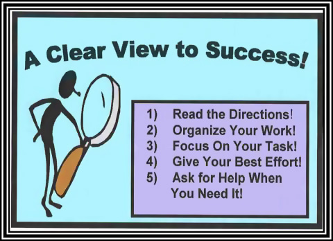
The bulletin board is laid out horizontally, and it is rectangular in shape. The background color is light blue. The border is a colorful, busy design. The heading is laid out in a horizontal arc and states “A Clear View to Success!” in a large, curly font in a darker blue. On the left side of the bulletin board is a very large picture of a screen beanie holding a large magnifying glass. In front of the screen beanie-and taking up the rest of the bulletin board-are five statements written in a large but narrow curly font that are laid out in a variety of directions within close proximity to one another. The statements include 1) Read the Directions! 2) Organize Your Work! 3) Focus on Your Task! 4) Give Your Best Effort! 5) Ask for Help When You Need It!
- Font color is low-contrast (pastel font against pastel background)
- Font is very curly
- Phrases are written in arcs and angles
- Spacing between letters and phrases is too close
- Border is busy and visually “cluttered”
Changes include:
- Higher contrast font color against pale background
- Simpler font (not curly)
- Phrases organized horizontally
- Text highlighted in a text box with a different pale background color
- Even and increased spacing between letters and among phrases
- Simpler border with less distracting, less “cluttered” design
- Braille overlay can easily be placed on top of significant text for Evan to read