How can teachers determine whether students are making appropriate progress?
Page 4: Create a Graph
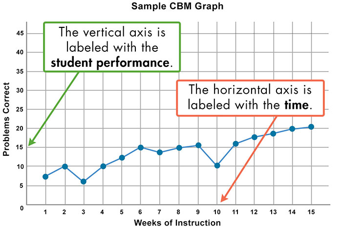 Having selected a measure, the educator should next prepare to collect and document student data. One effective way to do this is to use a graph, an integral part of progress monitoring. The vertical axis represents student performance on the GOM measure (e.g., number of problems correct), and the range of scores will vary for each type of measure. The horizontal axis represents time (e.g., days, weeks). Every time a GOM test is administered, its score is recorded on the graph. A line can be drawn to connect each data point to easily visualize a student’s development over time.
Unlike a list of scores, a graph offers educators a simple visual representation that can help them make quick instructional decisions. Some of the additional benefits of graphing for both educators and students are outlined in the table below.
| Benefits for Educators | Benefits for Students |
|---|---|
|
|
For Your Information
The National Center on Intensive Intervention (NCII) provides an Excel file that graphs student data entered by the educator. To view the tool, click the file below.
Student Progress Monitoring Tool for Data Collection and Graphing
![]()
As illustrated above, a graph provides an easy-to-understand visual representation of a student’s performance. Educators can obtain blank GOM graphs in several ways.
- Graphing software or capabilities are often included with commercially available GOM measures.
- A spreadsheet program like Numbers or Excel can be used to store and graph students’ data. For a free ready-made Excel file, see the FYI box to the right.
- Educator-made paper graphs are easy to create. Students can participate in this process and learn how to graph their own scores and to monitor their own performance.

Lynn Fuchs, PhD
Dunn Family Chair in Psychoeducational Assessment
Department of Special Education
Vanderbilt University